
Shahr Farsh(Carpet City)
With a broad selection of classic, contemporary and decorative carpets, Shahr Farsh communicates at substantial retail scale. Its identity needed to make the category immediately clear while remaining highly recognizable in busy stores and across urban advertising. The long-term collaboration began with the core identity and expanded into a practical system for everyday communication and major campaigns.
Brand Identity
Logo Design,Collaboration since 2016-2017
With our designs, your brand will have a stronger visual identity.
The Persian logotype and corporate color structure were developed with a direct, contemporary approach. A consistent grid, layout principles and a family of pictograms allow complex retail information to be understood quickly without fragmenting the brand. These rules were formalized in identity guidelines, making decisions repeatable from the smallest label to the largest media format.


Corporate Colors
All about colors, The Next Perspective formed the creative concept, linking brand strategy to identity and executed across a variety of applications. Art Direction and photography were utilised to set a unique image language for the brand, elevating engagement and expressing attention to breakthrough technologies and the sustainable categories that will enable a better tomorrow.


Carpet City Visual Identity
The brand manual should provide a concise and precise description that clearly reflects the brand identity. This section includes key principles, such as brand values, communication tone, and visual guidelines, to ensure alignment across all interactions and designs and maintain a unified brand identity.
Uniform Structure
a consistent and predictable arrangement of elements, often achieved through the use of grids or other structured layouts, to create a cohesive and easily understandable design


Pictogram guide
The grid system in pictogram design provides a precise and regular structure with geometric lines such as triangles that help the designer arrange elements in a consistent and symmetrical manner. This structure allows for scalability and ease of use of pictograms in different sizes and contexts. The combination of the grid and these elements helps designers create standard and understandable symbols.


Billboard Design
Shahr Farsh’s outdoor advertising is driven by simple, idea-led messages. From purchase offers to seasonal and topical communication, every campaign combines an instantly legible image with an accessible tone of voice. Sustained over time, this approach has made advertising more than short-term promotion; it has become part of the brand’s public personality and a recognizable voice in the city.
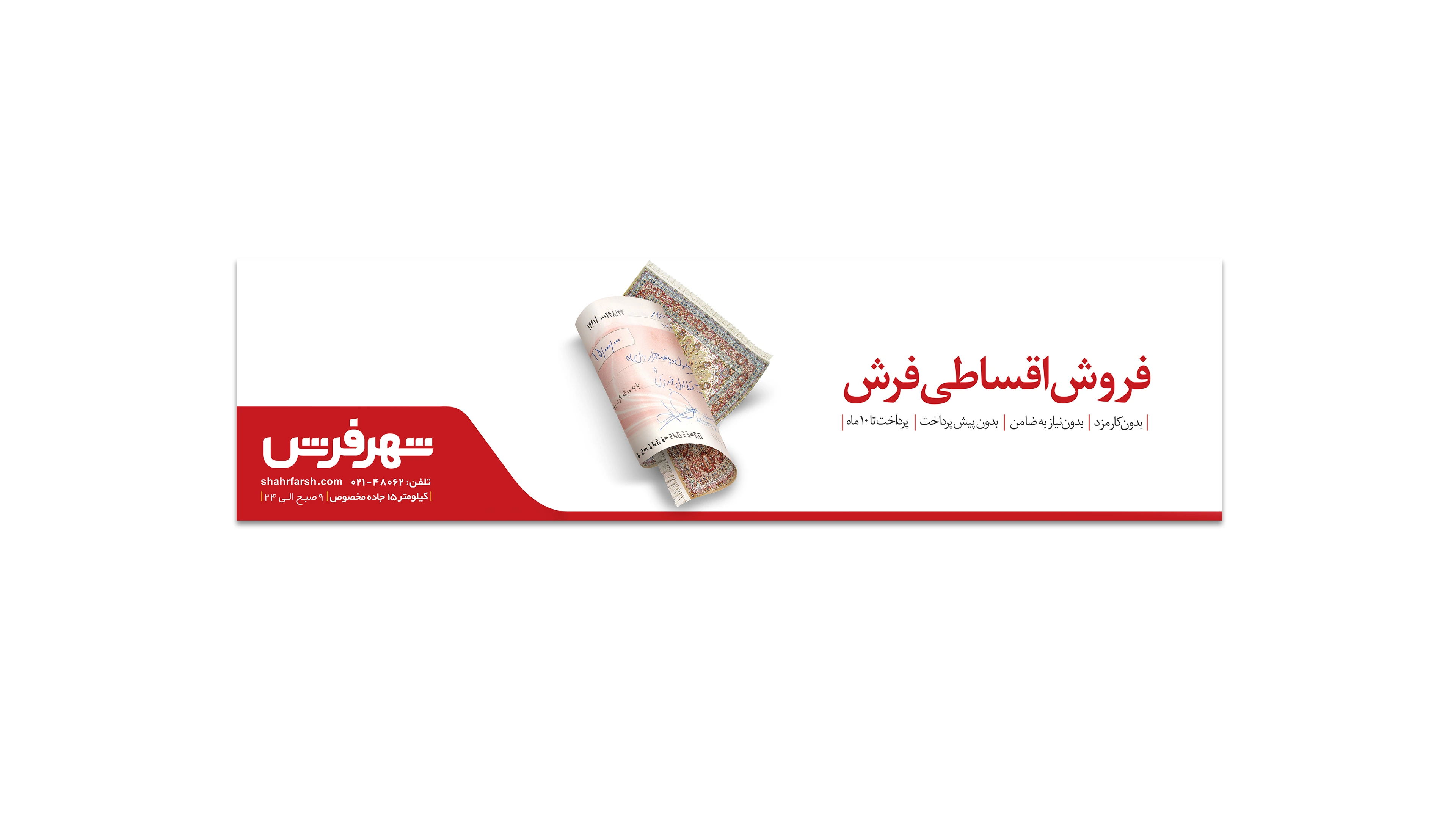
Billboard design / Carpets that are in mourning


Billboard design / Zero percent price increase

Lorem ipsum dolor sit amet, consectetur adipiscing elit, sed do eiusmod tempor incididunt ut labore.


Billboard design / Easy and affordable purchase


Billboard design / Strawboard


Ultimately, Shahr Farsh is more than a graphic work; it is a living illustration of the connection between indigenous culture and modern visual language. It shows how local traditions and identity can communicate with today’s audience in a new way, telling a timeless story. The combination of elegant forms, clever play of color, and precision of execution conveys both intimacy and a sense of discovery to the viewer. Today, this project stands as a prominent example of the creative interaction between graphic art and urban civilization, a pure journey that takes the audience not only with the image, but also with emotion and meaning.