PANAAH BUILDINGS
The name Panaah—meaning shelter—offered the central idea of the brand: home as a place of safety, calm and belonging. The design began with that meaning, bringing a human quality into the often technical language of construction. The resulting identity communicates strength while remaining composed, trustworthy and connected to the lived experience of a home.

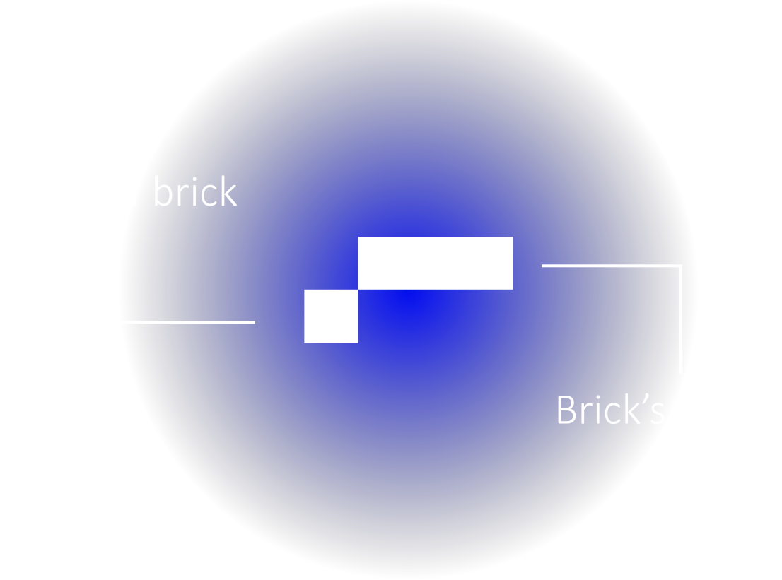
Sketches designed for Panaah



First Color
C:98
M:65
Y:65
B:100

Second Color
C:98
M:65
Y:65
B:100

Pattern Design
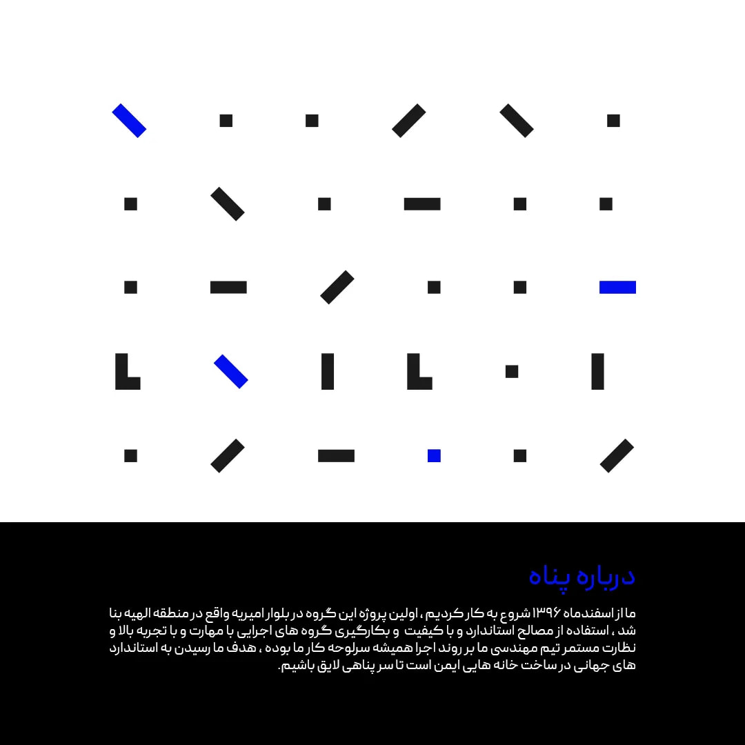
Early sketches explored architectural forms and the idea of enclosure, allowing the logo to express protection and structure with minimal means. A considered palette and proprietary pattern expanded that thought into a complete visual language. Flexible across scales, the pattern maintains recognition throughout print and digital applications without requiring the logo to dominate every composition.

Official Paper
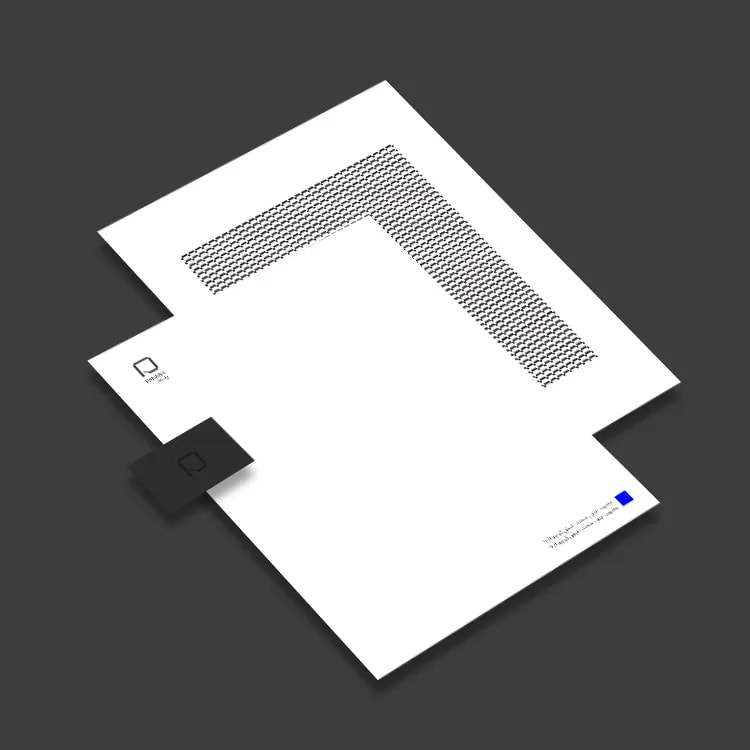
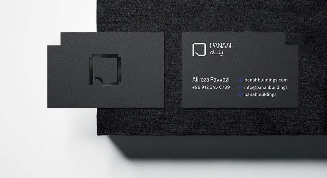
Business cards, letterheads, envelopes, and notepads were developed based on the brand’s visual identity, with careful consideration given to paper selection, double-sided printing, and finishing details such as foil stamping. The production process was also supervised through to the final stage, ensuring that the execution remained consistent with the defined visual standards.

Business Card / Note Sheet
Header Sheet / Envelope Paper
Publisher: Tarang(Print supervision)
Specs: Writing Paper, Bidirectional Printing, Hot stamp.
Release Date: July 2023
Language: English / Persian

some of our design
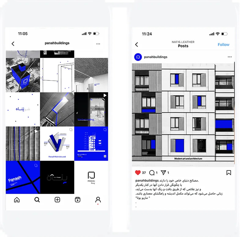
social media design


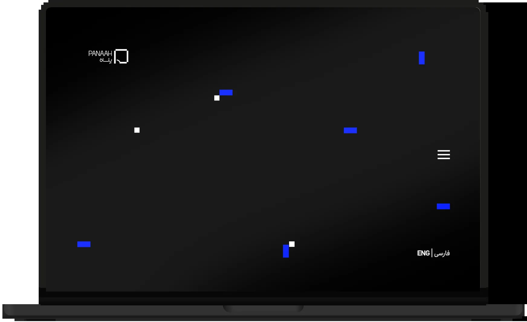
The website was designed to present projects, spatial imagery, and plans through a clear and accessible digital experience. Its information architecture and content structure work alongside the brand’s visual language to create an organized and functional experience, extending the identity’s central idea into the digital space: shelter is built to create a sense of security.
Instagram Layout